About Service Analytics
Service Analytics helps Service Managers and Reps get insights on their salesforce data and take relevant business actions. This app is built on the Salesforce Einstein Analytics platform. Some basics about the app:
- Website: Service Analytics
- Team: Myself, Product Manager, 2 Developers & User Researcher
- My Role: Desginer/Prototyper
- Collaboration: Salesforce Service Cloud teams & Service Managers and Reps
- Time: 2 years
The challenge
Salesforce customers have huge amount of data sitting on Salesforce and other platforms. One of the main struggles our customers face is designing information — more specifically, finding a task-oriented and actionable visual representation of their business goals.
When we started working on the Sales Anlytics App, the challenge was to use the existing Sales data and tell an insightful story to our users that helps them accomplish business goals in their day to day life.
Our approach
We approched this project with a user centered three step itarative process. This process included the entire team, stakeholders, users and researchers.
- Empathize - The goal of this step was to understand the target audience.
- Ideation - These were design studios where the entire team was involved in sketching and sharing their ideas.
- Design - We organized the lossely formed ideas from step 1 and 2 into a structure and got user feedback.
If you are curious to know more about our process, I wrote a medium blog elaborating our process of converting data to actionable insights.
Empathy - the bedrock of good design
The first step was understanding the end user. We did that by mapping the user’s path of inquiry, i.e. identifying user's goal and outlining user’s needs to achieve their goal. Some of the high level goals for the manager were to track case backlogs, review teams, and measure customer satisfaction. Then we listed out all the questions that user might ask to answer these goals, for example “How many cases are in backlog that are high priority?” or “Which rep is taking the longest to close a case?”. Lastly we identified the metric that answered the questions and prioritized them
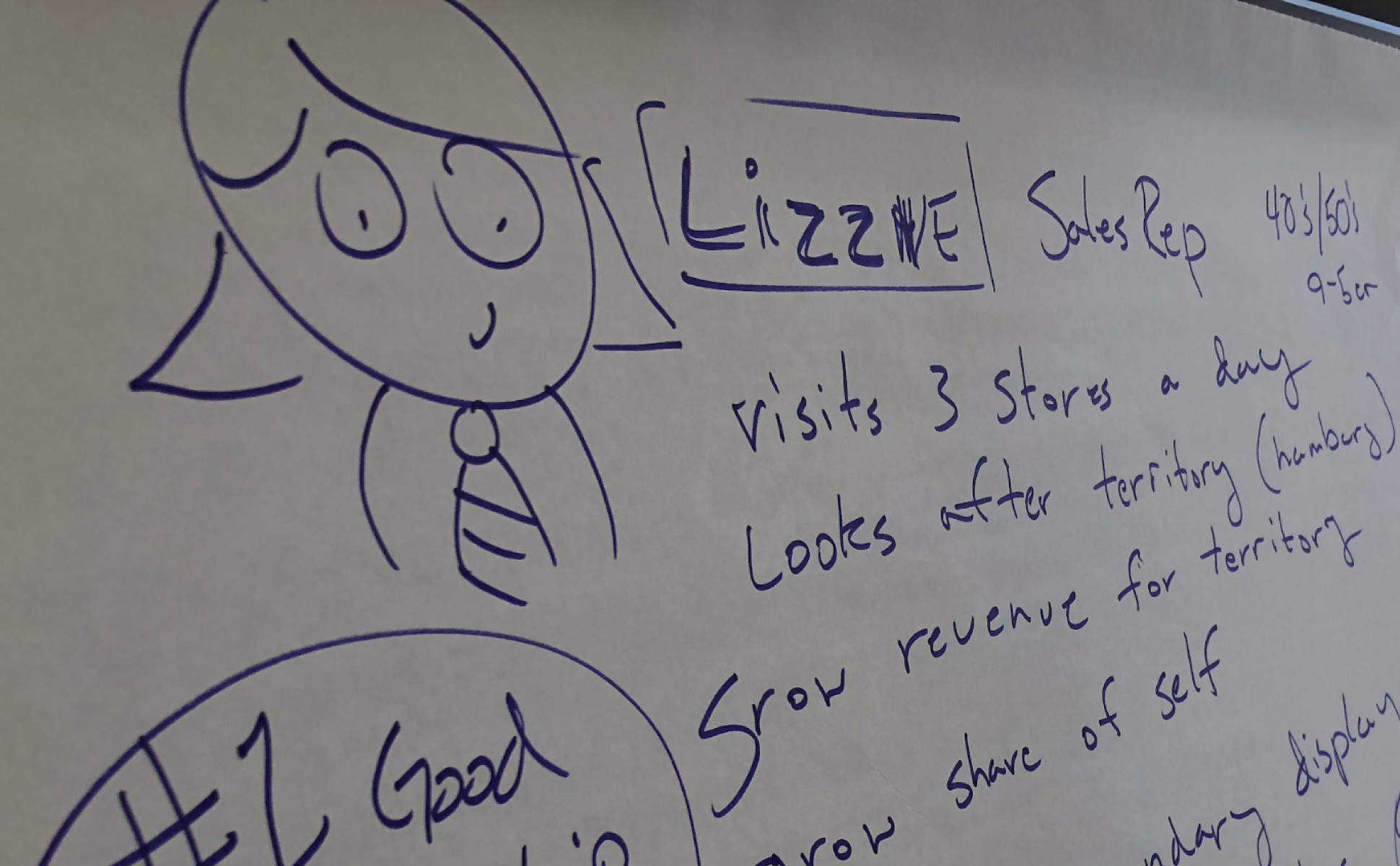
Empathy - Understanding user journey and goal
Ideation - collaborate on ideas
We did a 60–90 minutes design studios where the team got together to sketch and share. We did many rounds of design studios where the entire team sketched ideas to represent forecasting, measuring team performance, and similar metrics that a Sales Manager cares about. These collaborative workshop sessions were super helpful to kickstart a vision towards the final product. A diverse team brought in different ideas and viewpoints to the table. We emerged from these sessions with the strongest concepts and visualizations to represent them.
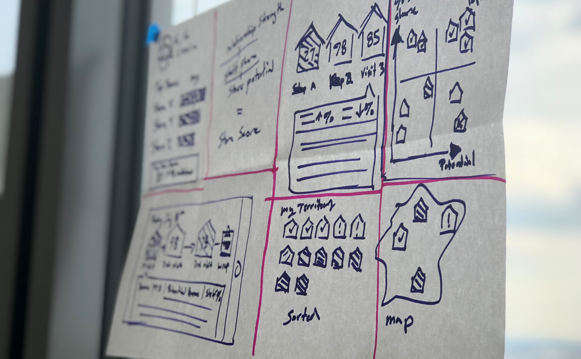
Ideation - Design studio with a diverse team to come up with concepts and solutions
Design - A plan for communicating
After the first two steps, we were left with a set of loosely organized ideas. We structured our app based on personas such as sales leaders, managers, and reps. Each persona had a set of pages or dashboards that are structured based on tasks that they perform.
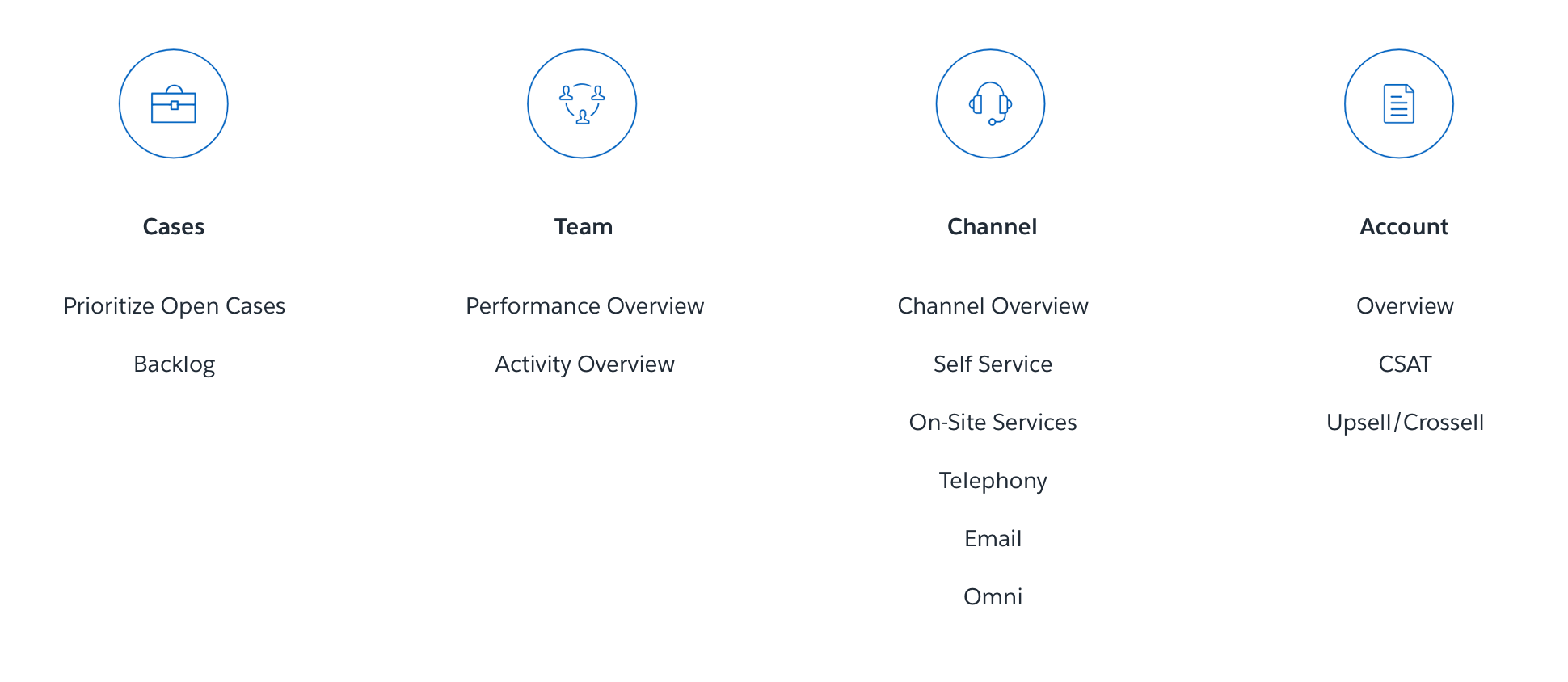
Task driven structure for the app
Pages can be laid out like a newspaper or article where they have a summary, content and conclusion. F, Z, and Side by Side layout were the most common layout we used for pages. These patterns help get the user’s attention to the summary KPIs first, followed by supporting visualizations and a detailed actions list at the end.
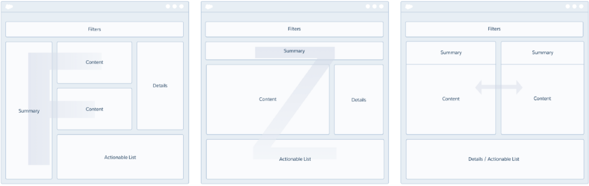
Page layout patterns for dashboards
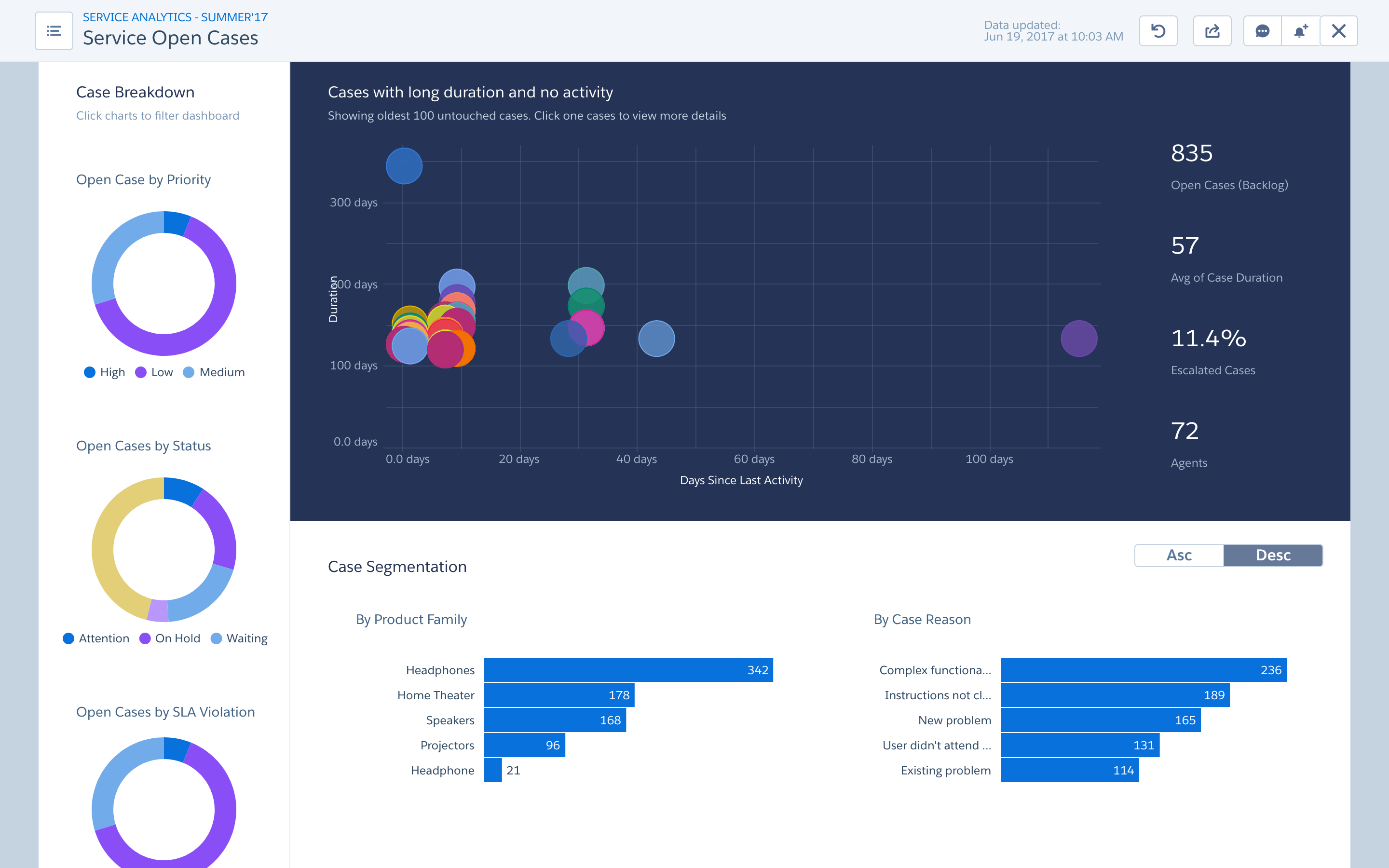
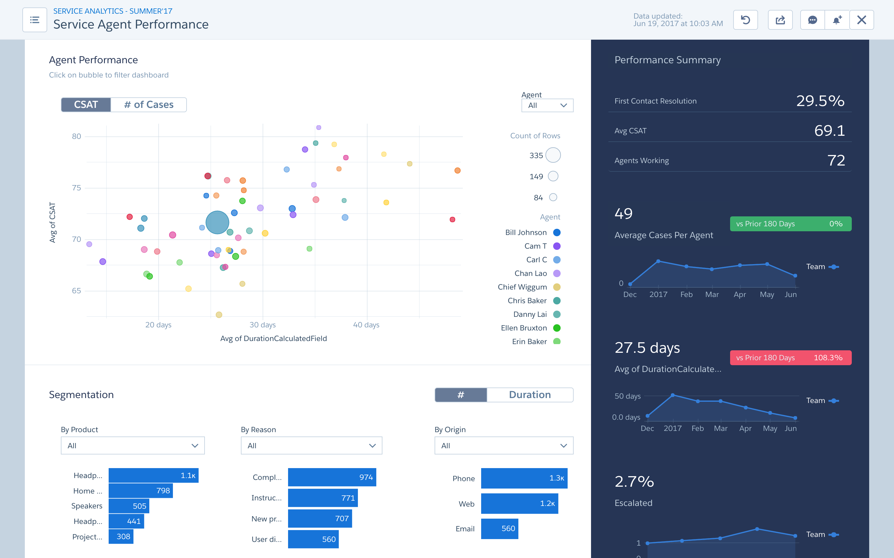
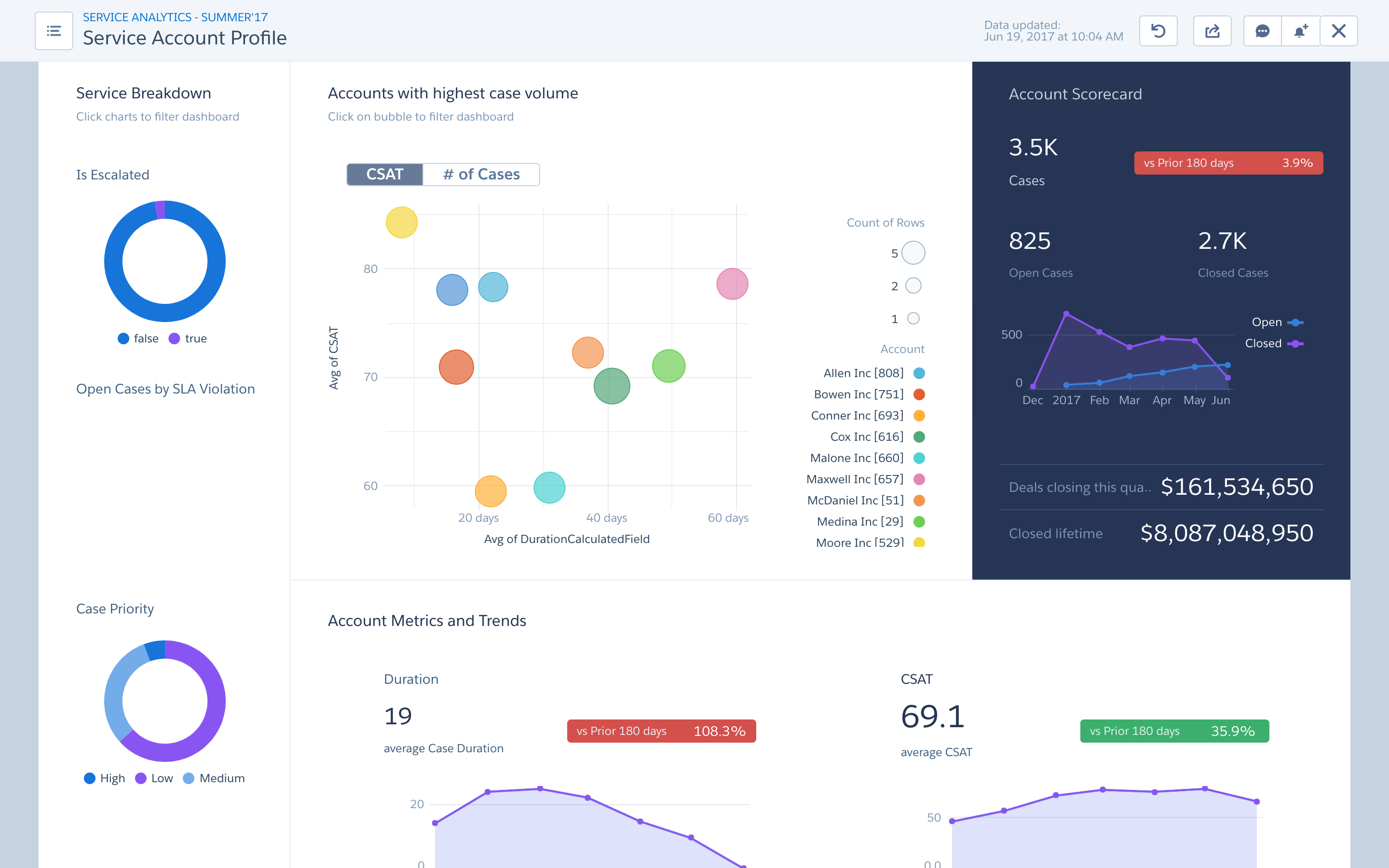
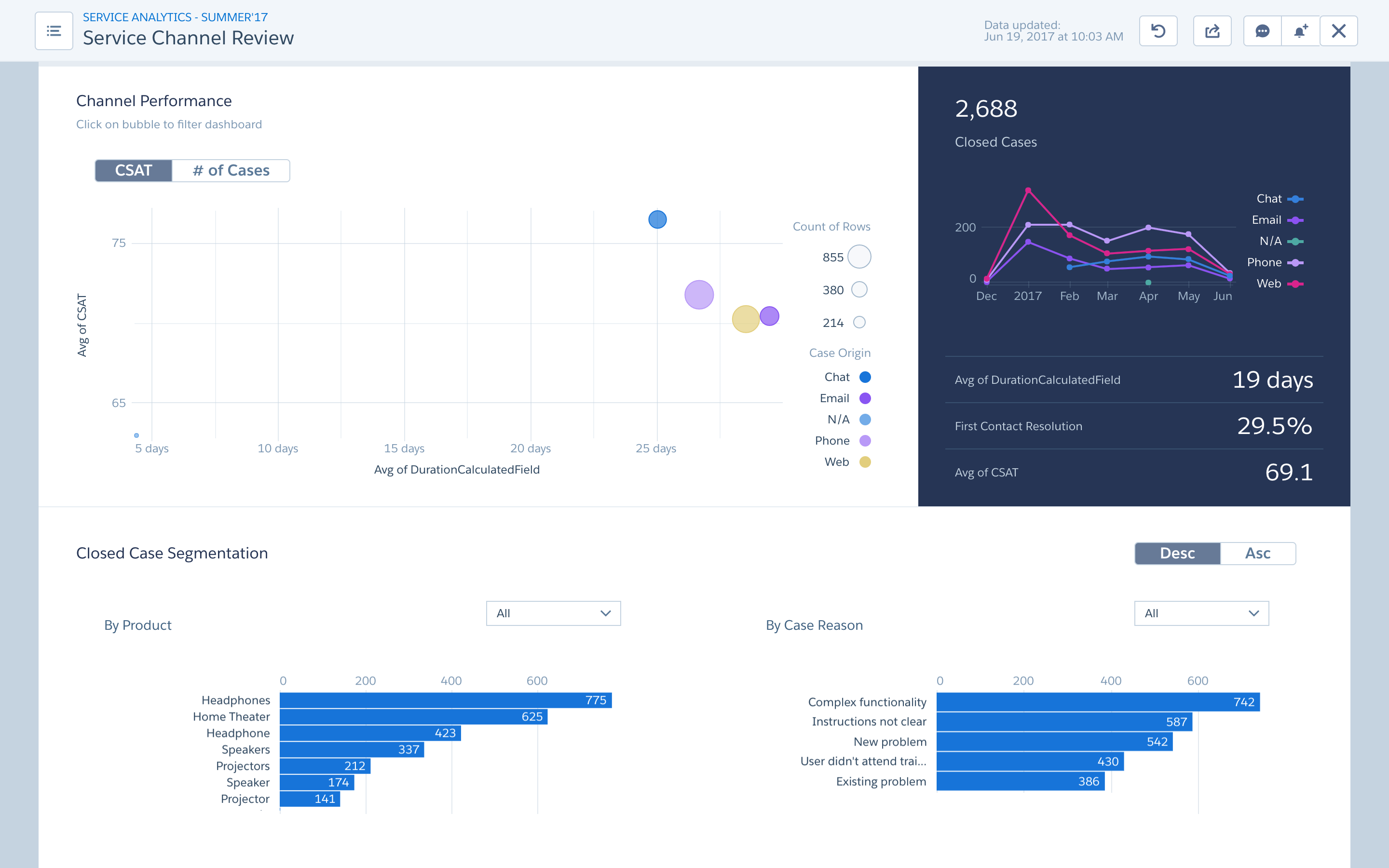
The final app
For the final app, we had a home page dashboard that listed out the most important KPI and provided the user with the right amount of information scent to dig deeper. Below are example screenshots of some dashboards in the app. Based on user study , important KPI and charts are laid out on a dark background to grab user's attention. More detailed charts and tables are on a white background, for users to dig deeper into their analysis.
Some of the constraints
Some of the constraints working on the project are
- Platform - This product is built on the Salesforce Analytics platform. Design and implementation decisions need to be made based on platform constraints.
- Data Density - Based on research and our experince, we found that users get lost when a dashboard has more than 5-7 visualization. So a fun constrainy in this project was to tell a story using 7 or less visualization. (Best constraint ever!)
Next steps
We have been getting feedback from our customers and iterating on the product. Based on user feedback and industry trend, we have been working on future explorations to inspire the Salesforce Analytics platform add features that our Sales Users want. As our platform matures we iterate on the app and make it simpler and more useful for our users.